
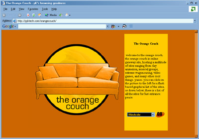
Name: the one and only theorangecouch.com design with an actual orange couch incorporated
Date of Snapshot: A long time ago.
Description: theorangecouch.com A joint venture of Rick Nishimura's money, and a bunch of nerdy 10th graders to pursue a dream. This design exhibited impressive graphics technique and bright in-your-face color, designed by nish, and stands to this day as the only site of Nish's that I actually like. This snapshot shows the basic usage of the original Orange Couch, as a portal. It connected the sites for Blindside, WagonX, Joe (Beatty)'s Artwork, The Benchwarmers for a limited time, and the site before pyktech, Floydian @ TOC.
Nish's Commentary: THIS PAGE KICKS ASS. YOU SEE THAT ORANGE COLORED SCROLL BAR!?!? FUCK PYKTECH!!!! TOC 4 LIFE
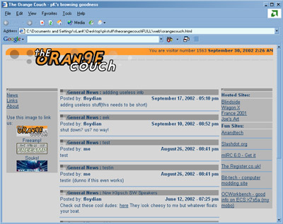
Name: grey + orange == the orange couch
Date of Snapshot: Less as long of a time ago (30 September 2002)
Description: This site was on autopay to Rick-Nish's credit card until late 2002, when it was shutdown due to neglect. This was the final look of TOC before it kicked the can; basic, but functional. This was designed my me, and it used a step-away-from-orange colour scheme. Orange burns into your retinas after long periods of staring, and with web pages, you may end up staring at the screen for a long enough period. Anyways, gray is a nice complement to orange, and fit in nicely with all that... stuff on TOC.
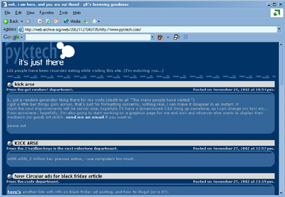
Name: pyktech in curved-corner rectangles
Date of Snapshot: November 2002
Description: v1.0 was a derivative of a script I made on sourceforge.net and Floydian@TOC for testing php stuff, and used the news script I derived from Nish. It was pretty basic, and had a very wide feeling, which was incongruent with the ammount of content on pyktech at that time (no real content at all).
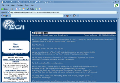
Name: pyktech alla the orange couch
Date of Snapshot: January 2003
Description: pyktech.com v1.5 utilized the same table aspects as v1.0, but with modifications to add a new feature, then named click clacks (now just click these, click clacks sounded like some toy train or some shi*). It used a off-center viewing field... which favored the right side, and weighed down that side because of it. For those of you that remember, it also included a keystroke counter script that displayed the number of keystrokes I had hit since August of 2002. The idea was as unpopular as a kid that pooped his pants in gym class. This page also has hints of theorangecouch.com along the top, I'm not sure why, it seemed like a good idea at the time.
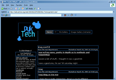
Name: pyktech.com in azzuro e nero
Date of Snapshot: March 2003
Description: This was made... sometime senior year, I believe in the late winter. It incorporates a thin border design I wanted really bad. I kept that design for awhile... mainly because it took forever to figure out cross-browser wise (which I ended up figuring out at my IBM mentorship). I had to add a solid color background onto the content tables, since they didn't contrast the background enough. However, I kind of liked the transparent-ish background, but it lacked solidity, and thus had to go. The logo was bland, but it was more of a testing logo for the design.
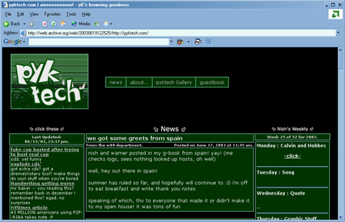
Name: pyktech in summer
Date of Snapshot: June 2003
Description: This is pyktech released sometime in late spring 2003, early summer, the logo was one that was more interesting than others I had made; it was the first time I had tried to incorporate a layered aspect to the logo, as to add more depth. It turned out well enough for my tastes, and had a summer feel. It was also the first time I incorporated font path skewing, which kicks ass. I used this design for about a year before changing to the current one, which still uses HTML tables (eek). This version incorporated such features as the Birthday Script, the Email Script, the addition of advanced log file analysis for visitors of pyktech, the Gallery script and the Guestbook script as well. Pretty much everything of any worth happened on this design and the last blue design. Oh yeah, Nish's Weekly debuted under this design, which he continually "forgets" to update. Lies.